After researching into various different design layouts for magazines, publications and books, I decided to follow a simple and modernist approach within my design.
My 10 Things You Should Know About Graphic Design:
- The Pantone Colour System
- Hierarchy Within Design
- Complementary Colours
- Picas, Points & Pixels
- The Anatomy Of A Typeface
- RGB & CMYK Colour Models
- Subtractive & Additive Colour Modes
- Tracking & Kerning
- Fonts & Typefaces
- Applying Typography To Grids
✿✿✿✿✿✿✿✿✿✿✿✿✿✿✿✿✿✿✿✿✿✿✿✿✿✿✿✿✿✿✿✿✿
Influences:
Newwork Magazine


I really love the way that Newwork Magazine's layouts are simplistic and how they use a minimal amount of colour within their design. I have chosen to work with similar rules when designing, for example the use of one or two colours plus stock. I have also decided to print onto newspaper or sugar paper, to get a similar feel as the Newwork Magazines have. The way that they lay out No.3 is interesting, and is similar to the way in which I would quite like to lay my numbers out on each page.
NoZine


Another layout I found interesting was within NoZine magazines. I like how they have overlapped text on text with, once again, the use of very little colour. I also really love the use of the colour green, as I was thinking about using it within my designs. The use of #5 is interesting once again, as it's pretty prominent on the page.
Eko Magazine

I found this double page spread layout quite influential due to the vast amount of white space used. It was interesting to see that not all dps designs have to be covered in image or bulks of text. I really like the jaunty use of the space, and don't think that all the white space ruins the design, however it would definitely look better printed onto some interesting stock. I also like the use of a line to underline Lutz, that lines up with the top of the first text column.
Zine: The Modernist
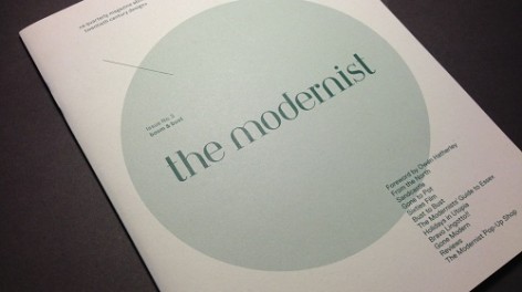
I found this zine design quite influential, as it doesn't follow obvious modernist guidelines and seems to have it's own contemporary twist to it. I like the use of a few colours on a greyish colour stock. I also, once again, love the use of overlapping the text over the images or shapes within the designs. I also think that the use of drop caps within the body text is quite interesting.
✿✿✿✿✿✿✿✿✿✿✿✿✿✿✿✿✿✿✿✿✿✿✿✿✿✿✿✿✿✿✿✿✿
Colour Scheme:

Considering the fact that I wanted to use green within my design, I decided to go with the colour Emerald, as it was voted Pantone Colour Of The Year, so I thought that it would be a good choice. I also thought that it would look aesthetically pleasing next to most colours, especially black, white and pastels.

To go with the Emerald colour, I wanted to use a colour that would complement it, so I thought a pink could look nice as it is close to the perceptual opposite of green.
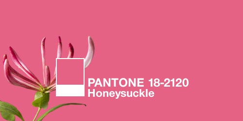
I quite like the colour Honeysuckle, as it is close to magenta but is a lighter version, rather than being such a bold pink, and was voted Pantone Colour Of The Year 2011. I prefer more pastel pinks, so might then use an opacity of the colour to make it lighter. I think that Honeysuckle 50% would look nicer next to Emerald.
I have also decided that, when it comes to showing colour like RGB and CMYK, I am going to use pastel or opacities of the colours, so that they aren't bright and inconsistent to the rest of the colour scheme.
✿✿✿✿✿✿✿✿✿✿✿✿✿✿✿✿✿✿✿✿✿✿✿✿✿✿✿✿✿✿✿✿✿
Fonts:
I have decided to use sans serif fonts within my publication, to suit the modernist and simplistic style that has influenced me with my designs. I also thought that they tend to be the most readable typefaces at all sizes, which helped me when picking my fonts.
Trump Gothic East Regular

I chose to use this typeface for my body copy, both in upper and lower case, as I like the condensed yet elegant feel that it has to it. Another reason for the choice was the design of the ampersand, as it was quite an unusual ampersand choice, which I really liked the look of.

Alternate Gothic No1 D Regular
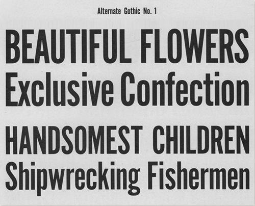
I decided to use this gothic typeface as well, because I thought it was quite similar to Trump Gothic, but wasn't as elegant looking. I thought that it would be a good typeface to use within my infographic designs or headers, due to the slightly bolder feel to it.
✿✿✿✿✿✿✿✿✿✿✿✿✿✿✿✿✿✿✿✿✿✿✿✿✿✿✿✿✿✿✿✿✿
Getting Down To Designing...

I decided to use a simple and clear structure for my layout, as I wanted to show off the white space of the pages, similar to the Lutz Magazine design in my influential research. The use of the Emerald colour to highlight certain words makes the text more legible and easier to read.

I thought I'd have a go at seeing how the same layout would look with a different set of text. I like how I've used the 4 rows in my grid system to separate the chunk of text so that it is clearer. It also looks nice right aligned on the recto page.

An example of the grid that I used throughout my designs...

I tried making the 1 larger so that it was more obvious, however it looked a bit less structured and jaunty, and didn't suit the style as much as before.

I thought that the verso page looked a bit plain and empty - a bit too much white space for my liking. So I tried using an image, that was relevant to the written text, to fill up the space. However, I thought the colours were too bright and it was maybe a bit too detailed and extreme for the modernistic theme I was following previously...

I also tried using an image of Pantone Swatches that wasn't as brightly coloured, and edited the image so that it was half tone, and a smaller size to follow the grid differently. However I thought it still looked a bit weird.

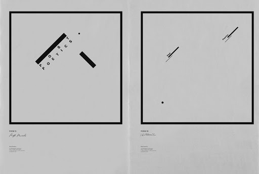
To see what the image idea could look like throughout the book, I tried using a previously made poster to show hierarchy within design, however this still wasn't working for me!

I think that this image works better, because of the use of colour which keeps the book consistent. However, I didn't really like the idea of using someone else's design work within my book, as I didn't feel as though it put the information across clearly, and was possibly breaching copyright infringements.

Another idea that came to mind was to show the Pantone colour that I was using within my book! I also thought that playing around with the actual structure of the paragraphs could help to bring the image into the design.

I think that it looks better with some text on the verso.

I then justified the text so that it tracked out along the width of the column. I thought that this was interesting, as it helped show the hierarchy within the book of where your eyes should look first.

I wasn't really sure on the image that I had chosen for the Pantone Swatch, as the text was a bit dull and pixelated.

I then played around with the second page of the book to see how that would look in the same layout as before. I really like this structure, however the image representing hierarchy still doesn't suit the book. I also didn't like the title for this page, so changed it to something more suited.

I think that the Pantone Swatch image looks much better when centred on the verso page. I think it could look better with a stroke surrounding it, to emphasise the image.

I gave the image a stroke on the second page so that you could see where the poster finished... This also looked better when centered.

The emphasised words in the bodycopy look much better in uppercase.

I then decided to try the structure out with my 3rd rule.

I couldn't really find anything previously made that could represent the use of complementary colours, so I decided to try and create something out of type. I think that this text based image that I produced was a bit too dull and uninteresting.

I thought that bringing the complementary colour into the design would help to prove my point. The thing is, I didn't want to create something that did hurt your eyes as it wouldn't look nice in my publication. Hence the use of a red that looks nicer next the Emerald than Pillarbox red would.

I thought I'd try to be a little bit witty by playing around with the word Pantone to create 'pant-no'. I quite like this idea, and think that it suits the theme.

Because I designed the 3rd image myself, I decided to go back to the 2nd rule and design something to represent structured hierarchy, based on the previous poster I had found. I think that the use of two colours and lines as well as broken type helps to show where the reader should look with their eyes.

I changed the Pantone page to a clearer one, and placed a stroke around it in Emerald 50%.

I didn't really like the line that came off of the bottom I in the image design and think that it looks much better without!

I decided to add a border to this verso image as well.

I then added a border to this image and thought that the bottom of it looked a bit plain, so placed the word hierarchy in there, just to get the point across completely.


When it came to creating something that represented picas, points and pixels, I struggled to come up with something innovative as they are all used as units of measurement. Hence the ruler. I really like this info graphic as it is clear and structured, and is obviously following the theme of the rest of my publication.

I realised that the number hadn't been changed to 04!!


For this page, I wanted to create a typographical anatomical based poster for the verso page. It was quite hard to produce, as there have been so many produced already to such a high standard. However, I am really pleased with the final outcome!


The one main issue is that the text is pretty small when the image is scaled down, this may need some slight alterations...

I was quite persistent over the colour scheme, so didn't really want to create anything that didn't follow it. This made creating something that was clear for the Subtractive & Additive Colours pretty difficult... I don't think this idea works at all, and it is hard to read.

I thought that using the actual colours would work a lot better, and would be easier to understand.

Initial Idea...

Creating CMYK & RGB circles...


I decided to go with pastelly colours of CMYK and RGB, as they weren't so contrasting against the Emerald and Black used within the rest of the design. I like the way this page looks, and love the use of the extra colours.

I then thought that my book was starting to get a bit repetitive, using the same structure on every single page. So I decided to switch it up just a little bit, so that every other page followed the same guideline.

I thought that it would make it clearer if I labelled the colour modes...

The third page needed changing so that it followed this new structure. I think this helps to make some of the images that I created more legible and nicer to look at.

I also changed the layout of page 7 to suit the structure.

Changing the layout helped make the Anatomy of a Typeface page clearer and easier to read, especially when it came to reading the small text. However, it's still quite hard to read...

When it came to producing the RGB & CMYK Colour Models design, I thought I'd use the circles of colour again, so that it looked similar to the subtractive and additive page. I also used the pastelly versions of each colour.

I thought that the circles probably needed type placed in them so that it was clear which colour was which, however black type looked really ugly!

I changed the type to white, which looked loads better. I think that this image works really well with the rest of the dps.


Representing tracking and kerning was quite dull, as there wasn't much I could do, except from the obvious: track and kern typography. However, I quite like what I came out with, and think that it's slightly witty. I messed around with the point sizes to make words more obvious in the example image.


Then it came back down to the James Bond Anatomy Example problem... I thought that maybe changing the example image so that it was less cluttered could help. I started by having it so just 'James Bond' showed you how the different parts of letters are separated and categorised.

I started to get bored of the fact that each page, except the colour pages only had the two colours within the designs, so I played around with the colour magenta as I thought it looked nice next to Emerald.


I think that changing the colour in this example image helps to make it stand out, and it looks more aesthetically pleasing on the page. I also had a bit of a play around with the Y in Hierarchy, to see what it would look like if the stem extended down the bottom of the image border.

Playing around with another typeface, to show the different between fonts and typefaces, I created quite a simple, yet interesting example.

I thought that the sentence along the right hand side of the image was clearer when written this way, rather than before. It also helps to bring the sentence across so that it lines up with the top and baseline of the rest of the text.

I then thought that I'd mess around with the colour pink a little bit more. However, I chose to use the colour Honeysuckle at 50% opacity, rather than Magenta, as it was nicer on the eyes.


I played around with the pink in the picas points and pixels example image, however I thought that it was quite distracting and didn't seem to work, so I kept the original green and black version.

I didn't like the previous use of highlighting the number 7 in pink, so scrapped that idea! Instead I thought the strokes underneath the headers looked best in pink alone.


I found it quite difficult to come up with something aesthetically pleasing for this page as it was down to showing how you could use a grid structure to help with composition within design. I didn't want to seem like a cocky designer who knew exactly how you should use a grid system, so thought that I would create something structured, yet playful so that it was nice to look at. I also made sure that I kept the grid on the page to make it obvious that it was used. I changed the grid lines to the Honeysuckle colour so that it suited the rest of the book.

The contents page was easy to design, as it just had to be simple, clear and coherent. I love the simplicity and the amount of obvious white space as it keeps your attention on the information that you need.

The front cover for the book was a hard decision when it came to designing something, as I didn't want to produce something that gave the rest of the book away, yet followed the entire theme to hold the consistency. I decided to produce something plain and to the point so that there was no confusion as to what the book was about. I think that the front cover will definitely look better once printed, as the white space won't be so prominent, as I'll be printing onto newspaper - a slightly greyer colour.
✿✿✿✿✿✿✿✿✿✿✿✿✿✿✿✿✿✿✿✿✿✿✿✿✿✿✿✿✿✿✿✿✿
Final Publication:


I really like my final publication, as I feel that it follows a consistent theme throughout and uses Van De Graaf to it's full potential. I also like the use of grids and columns within my pages, as it isn't obvious that I've been using them, as some books tend to look. I love the choice of colour that I went for in the end, and think that it helps the design look calm yet collective. I really enjoyed designing the entire publication, and it has been one of my favourite final pieces to create.